Thank you!

The end presentations are held and the course is finished.  We want to thank the groups that commented on our work!

The slides from the final presentation as well as our final report can be found in the menu bar in the upper right side of the blog.

Enjoy the reading and your summer holiday! If you’re looking for something nice to read on the beach, we really recommend the book “Information is beautiful” by David McCandless. It contains an amazing collection of infographics. No more boring Excel graphs!

Regards,

Clementina, Enrica, Veerle & Kine

Final concept

Route P

Route K

The final concept was based on a set of different visual cues:

Instead of a highlighted path, the whole area of interest is darker than the rest, in order to lead the attention of the viewer to the specific zone and to base the choice for a path only on the manipulation of the eye movements.

The starting point is bigger than the other pointers since it should be the first point the viewer looks at, being the first natural cognitive task of a map.

Once the users find the YOU ARE HERE point their neurons will be triggered to look for similar colours. That is why the colour of the starting pointer changes according to the one of the route that should be preferred.

The colours of the pointers are two primary colours of the CMYK scale which were chosen with the purpose to make the pointers stand out on the background. In order to enhance the contrast a green/yellow nuance was given to the grey background.

The 3D pointers are placed in different directions according to the two routes. The direction of the pointers is given by the orientation of the pointer itself and by its shadow. In order to make the user focus the attention on one specific set of pointers, also the shadows have been differentiated, giving different radius to the Gaussian blur.

Density circles highlight the areas that are most interesting for respectively museum visitors and shoppers. The circles have a different blur radius and transparency. This visual trick should also lead the perception of the user to focus on a different areas and a different colour as well.

Next step will be to test the map with real users and to see if this set of parameters and visual cues is effective in leading their choices.

Working on parameters

The visual parameters on which the map is based have been considered separately and have been developed further.

The parameters that were taken in account are:

  • Church symbols and street names
  • Symbols for the shopping route and museum route
  • Colours
  • Shape and shadows of the pointers
  • Density areas
  • Orientation

Church symbols and street names

Church symbols: first trial

Church symbols: simplified icons

Church symbols: third version

The street names were removed from the map, because it was considered more effective having clear reference points, such as the two churches, which area landmark easier to remember than street names. The symbols of the churches were modified from simplistic black and white sketches to balloons with even more linear symbols. The balloons were placed on a higher level, in order to prevent the church symbols to interfere with the pointers.

Symbols for the shopping route and museum route

Scenario-symbols for shopping and cultural/historical attraction

Museum/shopping more traditional icons

The first draft of the symbols was a kind of representation of two scenarios: the shopping and the historical path. The second proposal was aimed to fit more the simple style of the rest of the map and to use symbols that are already in the visual background of people. The symbols are visible outside the map. The viewer is supposed to link the symbol to the colour. This trick was used for two reasons: the pointers can be smaller and more visible without the redundancy of the symbols repeated, and the choice of the route can be based only on visual parameters without the influence of personal preferences towards the shopping or the museum route.

Colours

The magenta pointers were dominant because of the contrast with the background

Even if the contrast with the background is the same, violet is darker than magenta

Using the same tonality with two different intensities makes the darkest blue stand more than the lighter cyan

Colours close to the primary ones were tried for the pointers

The combination cyan and magenta seems to be the most successful one

After different trials, it was decided to use the CMYK code for the pointers and secondary, dimmed colours for the rest to create more contrast and let the pointers stand out.

Neutral grey colours were applied to the background

A greenish grey was tried out to stress more the contrast with the cyan/magenta pointers

Shape and shadow of the pointers


The drop-shaped pointers were modified and another 3d shape was tried out. The shadows were differentiated: the pointers on the preferred route have a more sharp edge, while the others have a bigger gaussian blur radius.

Density

Transparent circles were used for the first version of the high density areas

The circles were put in perspective and gaussian blur was applied to the edges, with a different radius

The circles were moved under the street network, to be less obtrusive in the drawing

The two areas with high density of attractions, one for each route, were tried out in different ways. The transparent circles were considered too overwhelming and static, as well as the faded circles in perspective on top of the drawing. Therefore a more successful trial was made with the areas under the network of the streets. Also to the blur of the area was applied a different radius of Gaussian blur as for the pointers shadows, to make one area more visible at first sight than the other.

Viewing orientation

Two different kinds of orientation of the map

The doubt of having one route closer than the other to the station was the reason why the viewing orientation was moved to in the middle of the angle of the two routes. But it was realized that this made them seem even far away. Therefore it was chosen the normal orientation according also to a criterion of usability: it was considered more important to make the angle of the map match the viewing angle of the viewer at the starting point of the station.

maps, data, flow.

To gather their data, Information Architects enlisted the help of the Twitter team and the Max Planck Institute, but in the spirit of social networking they also asked their audience for input. The final selection includes a fair few design names, with Pentagram, AIGA and Erik Spiekermann all making the cut alongside celebrities, newspapers, politicians and scientists.

This is a good example of how data intensity can be visualised in a 2d dimension and how the different parameters can be showed dynamically in relation with each other.

This graphic, by Kiss Me I’m Polish, showed the state of the death penalty in different countries around the world.

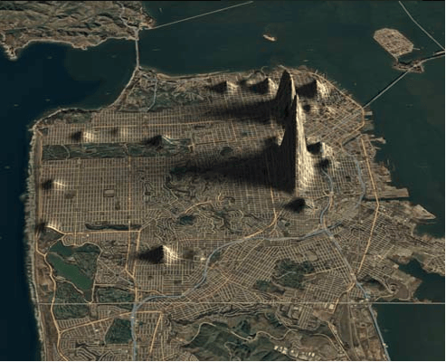
Doug McCune maps San Francisco crime in 2009 as if it were elevation. Peaks and valleys emerge with the rolling terrains of crime. The above is the map for prostitution.

An example of an extreme map instead, using only one color, is designed by BUILD.

Michael C. Place and his keen sense of detail, proportion and colour puts Pantone PMS 806 to work. Spanning the coast from Vancouver to Los Angeles, this slice of design heaven will jump off any wall.

Is amazing how using a strong color on a white background could give so much information about the landscape details.

Splitting up parameters

We have chosen to split the different paramterers or aspect of the map and let the different group members work with these parameters individually. The results for each parameters will be posted whenever they are ready, as this is an ongoing process. In the end, all parameters will be combined in a new, improved map design. The different parameters are:

  • The shape of the map pointers and the shadow of these pointers
  • The colours of the pointers, the background, the active area and the density marks
  • Street names and symbols
  • How to visualize what the pointers symbolize (museum and shopping) without using a legenda.

 Street names and symbols

 As this map will only be shown at the beginning of the route when people are at the station, it would be useless to show all the street names and all the interesting buildings, shops and points of interest. This would only result in an information overload and the map reader would not be able to remember most of it. Instead, we asked ourselves:

What kind of informatio do we want the user to remember?

It resulted in only listing the four main streets and places on the route:

  • Oude Delft
  • Koornmarkt
  • Gasthuislaan
  • Grote markt

This was supplemented with two naive drawings of the two big churches in Delft. The one is drawn with its characteristic skew tower and the other is seen at the big market. These churches are meant to help orientate as they are visible even from the beginning of the route.


First user test

Concept A was chosen as a starting point for further development. Concept A can be found on the page “Concept presentation” on the upper right menu bar of this blog. A small user test was conducted to see if the shadow theory as a means of changing viewing orientation was actually working. The test was executed with six persons who were not acquainted with Delft. The test procedure and a description of the participants can be found below.

Participant 1: Museum route

  • Did not notice a difference between the two maps
  • Chose correctly for the clockwise museum route without being able to name the reason for this, other than the fact that it “felt right”.

Participant 2: Shopping route

  • Did not notice a difference between the two maps
  • Chose correctly for the counterclockwise shopping route, without being able to name the reason for this, other than the fact that it “felt right”.

Participant 3: Museum route

  • Noticed that the “You are here” was placed at the other side of the figure for the two maps
  • Chose correctly for the clockwise museum route, without being able to name the reason for this, other than the fact that it “felt right”

Participant 4: Shopping route

  • Did not notice a difference between the two maps
  • Chose incorrectly for the clockwise museum route. Argued that this felt more natural as he was following the direction of which the shadows were pointing.

Participant 5: Museum route

  • Did not notice a difference between the two maps
  • Chose incorrectly for the counterclockwise museum route. Argued that it looked like there was more to do at the right side of the city and would not waste his time starting at the “boring” side.

Participant 6: Shopping route

  • Did notice the different color of the starting figure
  • Chose correctly for the shopping route, without being able to name a specific reason for this.

the world in a map

When we have a map in our hands we look at the reality and then we look at the map, trying to find correspondences between the outside world and that piece of paper full of colors, lines and symbols. We navigate the reality through the map’s hints or maybe it’s the other way around, we are able to read the map linking symbols and shapes to real entities in the outside world.

A map indeed it’s not the reality. Rather than being a picture of the world, a map it’s an abstraction of space and dimension. Most of the times a map it’s an attempt to represent with visual cues one or more particular aspects of the space around us.

The map we want to show you are an example on how the world is filled, transformed, sometimes even deformed with the purpose of communicating a peculiar and specific aspect of the world itself.

Take a look and be inspired!

CityMurmur_Madrid

CityMurmur tries to understand and visualize how media attention reshapes the urban space and city.

Sha Hwang_New York

Sha Hwang, from Stamen Design, has recently created a series of though-provoking visualizations on the NYC subway ridership over the last decades.

Space Syntax

Space Syntax

Professor Bill Hillier and his colleagues at University College London through over twenty years of research-informed consulting, they have developed a powerful computer-based modelling technique that demonstrates the key role of spatial layout in shaping patterns of human behaviour. These patterns include movement on foot, on cycles and in vehicles; wayfinding and purchasing in retail environments; vulnerability and criminal activity in buildings and urban settings; co-presence and communications in the workplace.

Jeorge Ayala_China

The model from the architect Jeorge Ayala consists of a mesh of densities within an urban framework that seeks to understand, articulate, and visualize possibilities for the hyper dense, programmatic difference, and radically optimized new agglomerations in China.

Ork posters_Chicago

A really nice and graphical visualization of the neighbourhoods of Chicago by Ork.

Aaron Koblin_Flight patterns

This interactive map charts air traffic over North America, visualizing data about aircraft models, flight routes, and altitudes.

Brandon Martin-Anderson_Shortest Path Tree of Seattle

Derived from the Open Street Map of Seattle, this representation of bicycle and walking paths within the city was created by artist and designer Martin-Anderson.

Oscar Karlin_London tube map redesign

Oscar Karlin_London tube map redesign: detail

Time Travel was part of one of Oskar Karlin’s final projects at London College of Printing (now London College of Communication). It started as an attempt to redesign the London Underground map. As Karlin puts it: “How could I come up with some innovative ideas to this piece of design that is by many considered as one of the best in graphic design ever”

Karlin started thinking on what’s currently different in the world from when the map was designed, and pointed time as the key differentiator. As he explains: “Today you never tell anyone how far away in miles you live, but in minutes or perhaps hours if you’re unlucky”. Therefore, Karlin decided to create a re-design based on time instead of geographical distance.

Since Karlin’s school was in Elephant & Castle, he used the station as time 0 and then created zones for each 5 minutes travel from Elephant & Castle. The idea is that the background is different on each station around the system.

Lee Jang Sub_ Complexcity: Moscow

Lee Jang Sub_ Complexcity: Paris

The Complexcity project explores major cities around the world focussing on how their urban sprawls have evolved over time. Using the patterns formed by roads in each city, Korean born designer Lee Jang Sub creates complex graphic configurations, combining the idea of natural and man made systems. In the process he finds a concealed aesthetic within the convoluted pattern of urban networks.The first image illustrates the intricate urban pattern of Moscow, while the second is representative of Paris.

Kim Ji-Hwan, Jin Sol_ Tokyo subway system

Kim Ji-Hwan, Jin Sol_ Seoul subway system

According to the authors, each city’s various subway structures and railway systems should reflect somehow the character of that city. In an effort to infuse the city’s identity into its subway map, while also trying to simplify and beautify the original diagram, Kim Ji-Hwan and Jin Sol produced a series of original maps for three city subway systems.

The first image depicts Tokyo’s intricate network of subway, lightrail and monorail, with more than 1500 stations covering the metropolitan area. Placed in the city center is the Imperial Palace, the residence of the current Ten-no (Japanese Emperor). Subway lines circumvent the expansive ground claimed by the Imperial Palace. This characteristic is visualized in this map by the concentric circles spreading out to the entire city, with the center in the Imperial Palace ground. This strong representation of circles is reminiscent of the national flag of Japan and the Japanese identity expressed in the flag.

The second represents Seoul’s network. The city boasts 600 years of history as the capital of the South Korea and its crossed by a river of great magnitude, which has become one of its most important symbols, the Han Gang. The depiction of Han River in this map mimics the curvature in the middle of the Tae-Geuk mark of the national flag of Korea. The overall circular shape of the map was also inspired by the Tae-Geuk mark. The brighter area in the center of the map shows the territory of Han Yang, the old capital of Cho-Sun Dynasty. This was the old Seoul marked by the Four Gates, and the growth of the city becomes clear when compared to the modern metropolitan sprawl.

Visual tracks

To represent the Spoorzone project we decided to focus on the vision of Joan Busquets.

In the vision of the architect, the Spoorzone is the connection between east, west, north and south. The station is the central point in the heart of the city. The train is a very important means of transport for the future. Cyclists, pedestrians and public transport have been the starting points for his vision. Of course, cars are not forgotten, but parking is possible under the ground. The presence of water and green is important in his vision. Water is chosen not only for the necessary water storage (rain water etc, living with water is a big thing in the Netherlands as we are in fact below sea level), but also to connect or to separate . Station Zone will be a dynamic space where people can work and live.

Another important aspect of his vision which is not mentioned here, is the fact that there will be better transitions between the old and new parts of Delft: For instance, now there is a world of difference when entering the Phoenixstraat if you come from the Oude Delft (nice and cozy). You are suddenly thrown into a modern street. In the new plan, the Phoenix street will be made more in the style of Oude Delft with trees etc, and the transition from old to modern will be through the waterline at the Spoorsingel and the district Hof van Delft.

We decided Joan Busquet to be the sender of our posters and the students to be the receivers. We imagined that the architects wanted to involve the students in a competition about the Spoorzone project.

The vision of the architect has been communicated focusing on different visual means: color, composition, third dimension and storytelling.

Color

Composition

Third dimension

Storytelling

Spoorzone

Project

The current train station is a problem in delft due to the increased level of train traffic along the station. Delft station nowadays is a bottleneck because it is the buses railway line in the Randstad with 350 trains per day.  There is also an environmental problem due the noise for the neighbours around the station.  The station has only a double track and therefore not growing with the as other Randstad cities a four track stations.

New building

Plan

A tunnel with room for four tracks will be built. The tunnel is 2300 meters long and runs from DSM/ GIST to the Engelse abtswoudseweg on the south. Between the Phoenix straat and the spoorsingel is a canal on the side of the spoorsingel. Under the canal there is an underground garage with approximately 650 locations. The bulwark is a green space with water. The new station building on the North side of the station is combined with new municipal council offices. Over the southern part of the tunnel is a city park. There are new homes built in the middle and southern part of the railway zone.

Plan

Tunnel

Two tunnel tubes are built together. The second tunnel is undecorated (Casco) and therefore there are no tracks in yet. When Ministry of Transports will found that 4 tracks are needed, the second track will be made ready for use.

Tunnel

Houses and offices

The development of the railway zone includes the construction of new homes and offices. In 2013 there are 1500 new homes and 23000 square feet office planned. The new buildings are mainly planned around the station and the new city park. The houses are planned for selling and also for student houses. Both the design of the houses and the offices are not fixed. It must fit in the master plan and that has to fit in the quality plan that the city of delft established. (In the master plan there is a description for the material use and other architectural rules)

City (municipality) office and the station

Central point of the new Spoorzone is the building which has two functions a recognizable and functional station and a representative accommodation for the municipal organization, with workstations for about 1000 employees.

The new station is built on top of the tunnel and travelers can go from there to the underground platforms. The city office creates an entire new building for al municipality organization. Everything under one roof instead of separate buildings like it is now.

Transportation

At the new station travelers can go by tram, train, bus and taxi.  There will be some parking places for train travelers and also a kiss & ride stroke, where travelers can be dropped by car. Travelers by bike can park their bike in a special underground parking space with 5000 places. From the parking travelers immediately can go to the station or the platforms. To reach the parking place there is a special bike path to the station. Also new parking place will be built (near the spoortunnel) and contains around 650 places for cars.

Water & Park

Central above the tunnel is a rectangular park of 40 meters wide and 600 meters long. The mid-westlandse weg seperates the north part from the southern part. By the Crossing roads the visitors can go from the north true the south. In the park there will be a lot of water for storing water and also from historical point of view.

Park

Consistency guaranteed

To keep high quality guaranty for this long term project,  it has been written a plan of prof.  Busquets which contains rules for the architecture and materials of construction which are required. This image quality plan is developed to provide for a framework so that the atmosphere and the look of the city delft can be continued. There frames develops a certain consistency for the center Delft and guarantees quality.

(more information to download on the website http://www.spoorzonedelft.nl/ )

Shaping the abstraction

Do ideas have a shape? How can we visualize an abstraction? Great thinkers of the past were struggling about the possibility of showing a concept without downgrading the concept itself.
If we think to the architectural avanguards of the sixties and seventies (Archizoom, Superstudio, Constant) they were trying to express visions of the city that were completely different from the reality, although the representation of those ideas was referring to elements of the reality, like the typewriting of Branzi’s Non-stop city or the Superstudio collages about the Continuous monument. Is the visual language the fittest to express abstractions? Can we bend shapes under the power of ideas or do we have to adapt ideas to the fixed borders of shapes?

Constant_New Babylon

Superstudio_ Continuous monument

Andrea Branzi_Non-stop city

Design a site like this with WordPress.com
Get started